Dotty Bingo
Website Re-design
More Than a Makeover: Design boosts revenue, secures top bingo brand status!!!
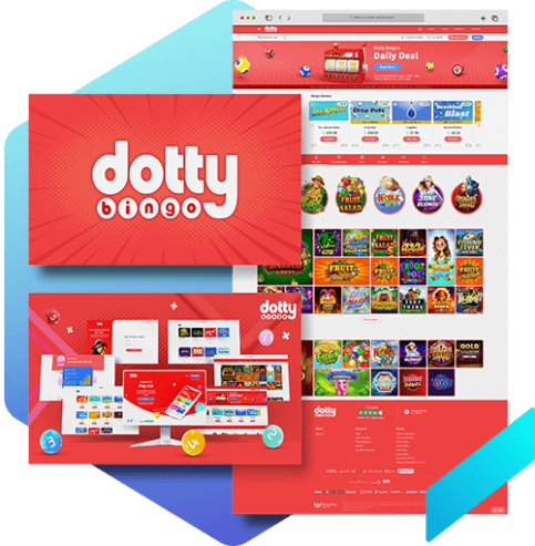
Project Overview
The decision to modernise Dotty Bingo was essential for a number of reasons. First, the old designs presented legal and societal risks since they weren't compliant to Safer Gambling Authority (UK) requirements. Second, the childish character and overall appearance raised concerns about appealing to children. In addition, it was an excellent opportunity to update the user interface (UI). In the end, the design upgrade focused on compliance, protecting against users who were underage, and enhancing the user experience.
Role
User Interface Designer
Duration
4 Weeks
Tools
Sketch/Figma, Photoshop, Illustrator
Design Process
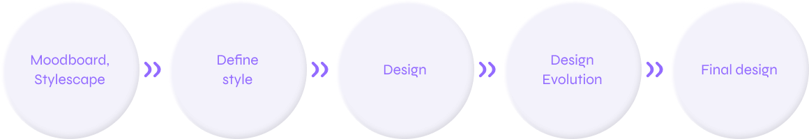
Design Solution
Moodboard
When I first began working on this assignment, I put together a Moodboard with a variety of examples of colourful, sophisticated apps. I then made some banner examples for myself to see how they may appear in practise, and I instantly recognised the theme that best suited it.
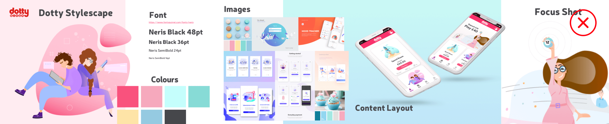
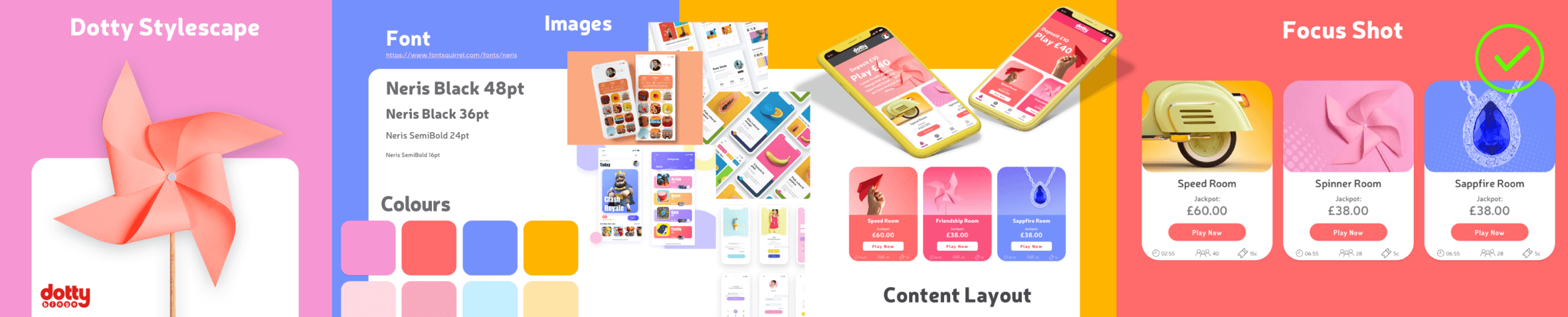
Stylescapes
When the basic theme was uncovered, I created two Stylescapes. The top one has delicate pastel-colored hand-drawn vector characters. The bottom one was balancing it out with realistic, vibrant, and subtly saturated colour pictures. We ultimately decided to go with the second style after I tested it internally with important stakeholders.
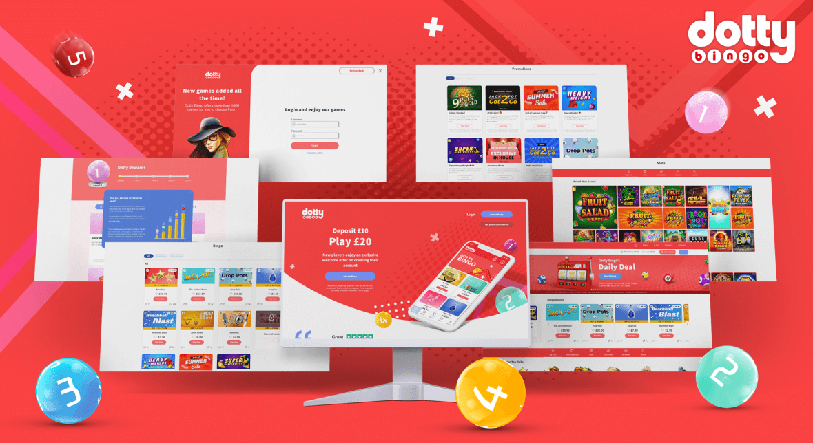
Result
I'm thrilled to present the outcomes of our bingo website revamp. My objective was to design a website that is responsive, visually appealing, and modern while still retaining the friendly and happy vibe of an online bingo hall. I additionally kept it simple for users to select their favourite games, explore the website, and seek support when necessary.
With a new and fresh approach, I think I've succeeded in achieving all of these objectives. The website now has greater accessibility and user-friendliness, as well as original artwork that evokes nostalgia and excitement.
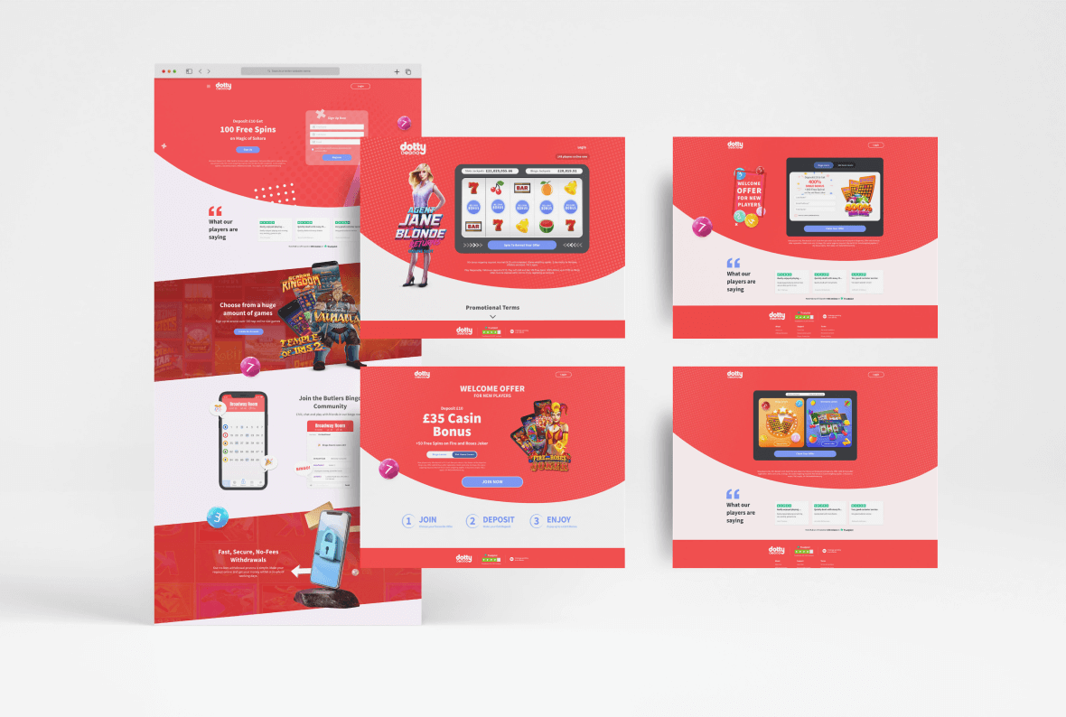
Game and Promo Pages
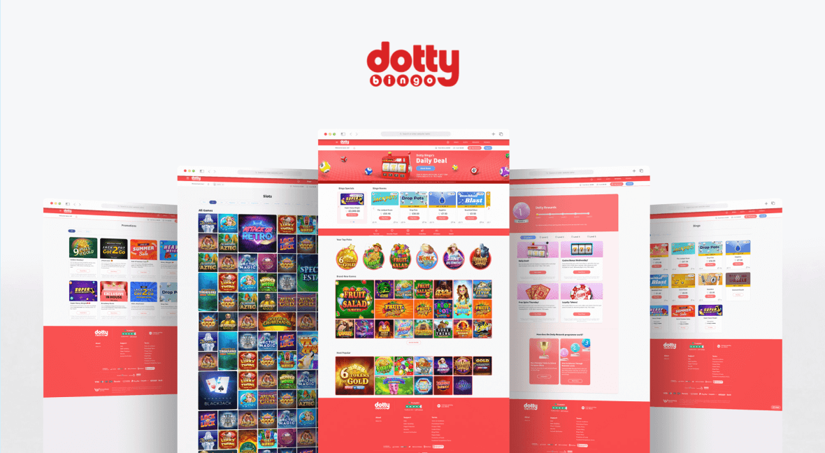
Landing Pages
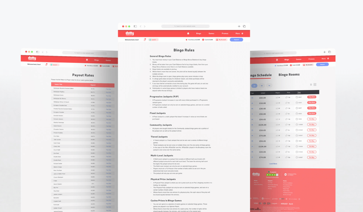
Text, table, form pages
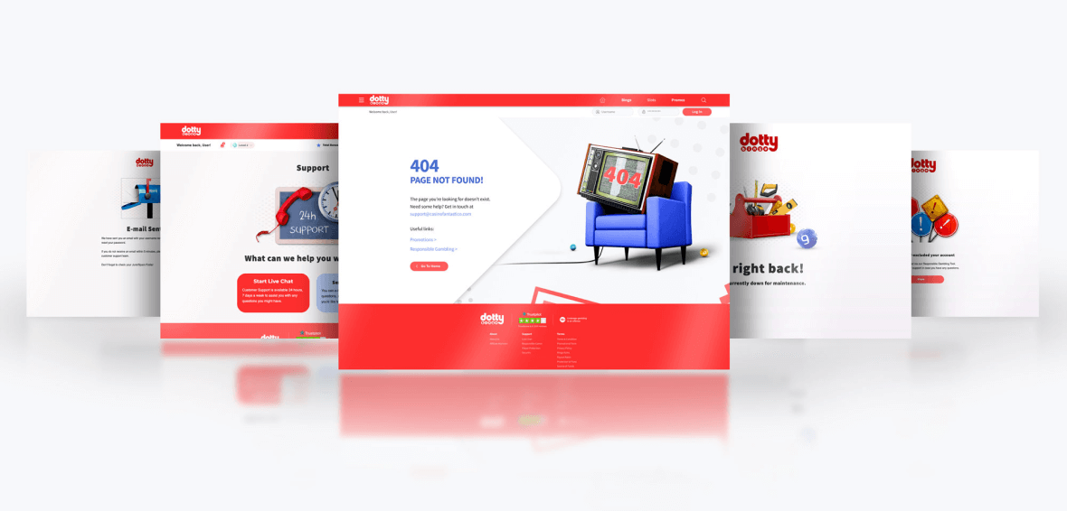
Utility, Empty state pages
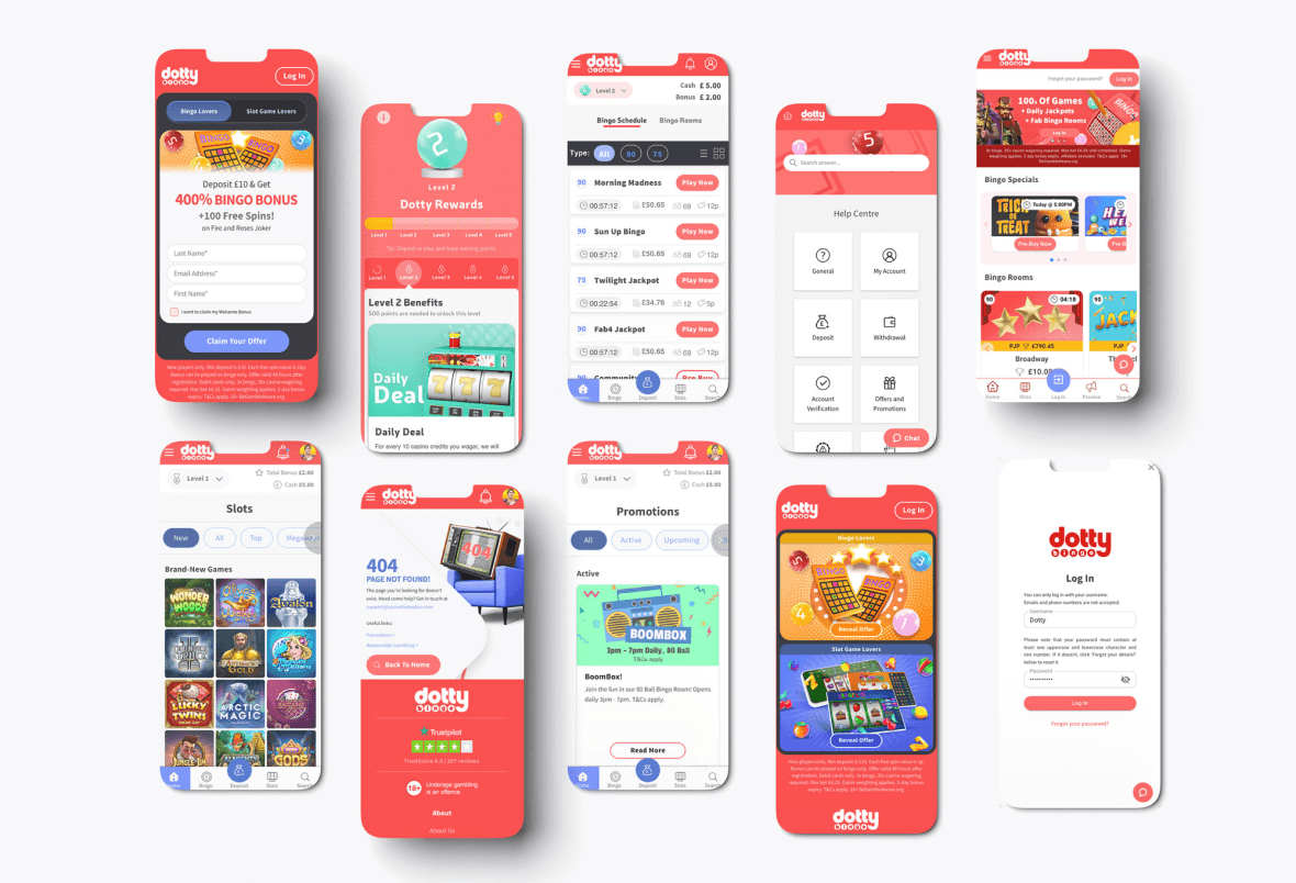
Mobile Pages
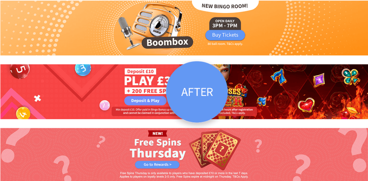
Before & After
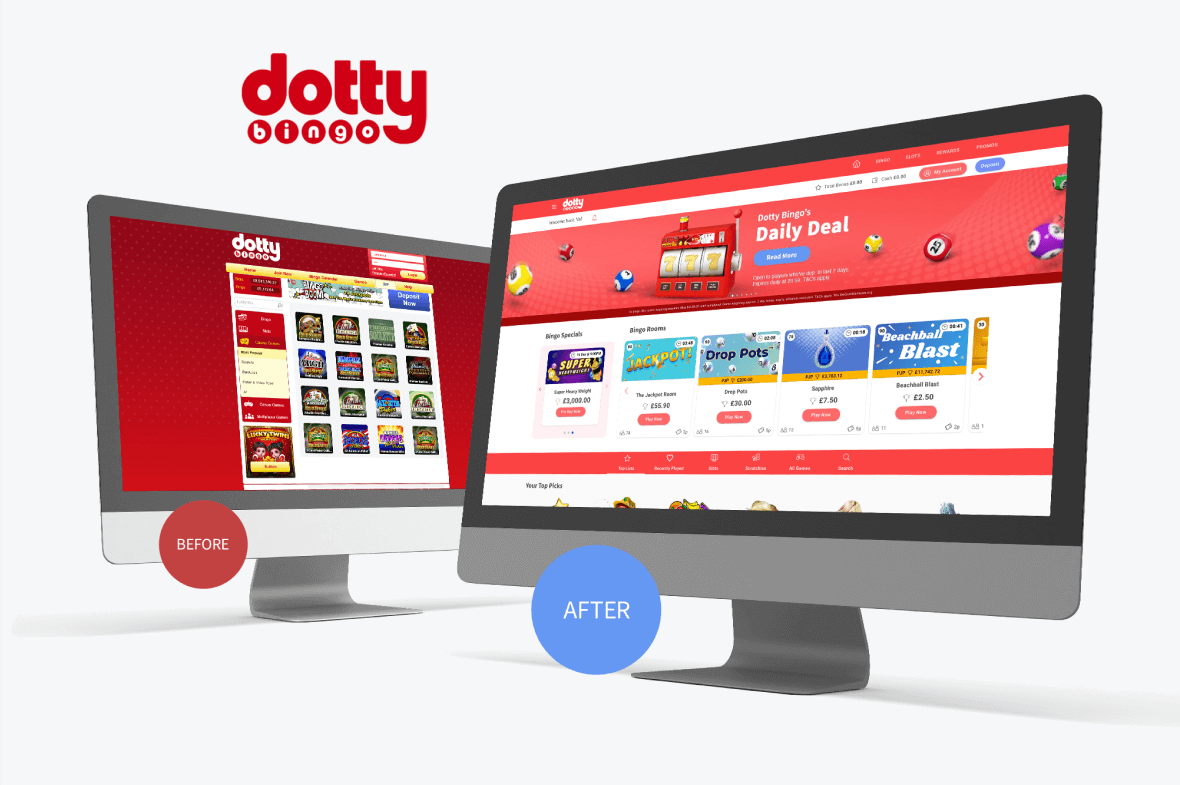
Here are a few instances of banners that are both compliant and non-compliant. How much of an improvement there is is evident immediately. The cartoonish character was dropped and replaced by contemporary, colour-rich, realistic graphics. The homepage now features a responsive full-page design with lots of white space and an elegant appearance.
Before
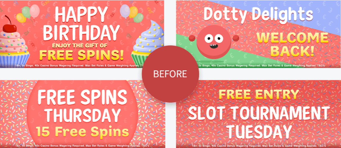
After
Home page before & after
Final Thoughts
This project involved designing the user interface for the Dotty Bingo website, fully responsive, a mobile-first online gambling platform. The key goals of the design were to create a visually appealing and engaging experience, ensure ease of use and navigation, and reflect the new brand identity of Dotty Bingo.
The website has a clean and modern design with a focus on “worm” red and “calm” blue branding.
The layout is simple and easy to navigate, with the main navigation bar at the top and the main content area in the centre.
The website uses a lot of white space, which makes it feel open and airy.
Contact
valiux79@gmail.com
Phone
+353 89 435 0505

© 2024 - Valerijus Jurcia / All Rights Reserved