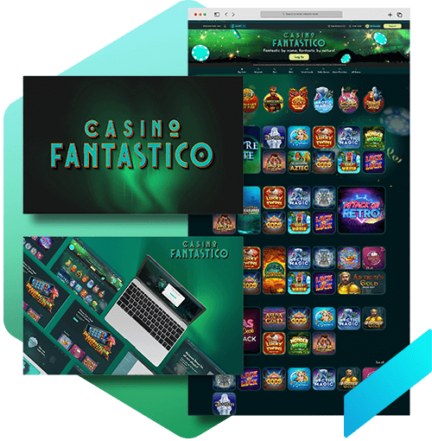
Casino Fantastico
Case Study
Complete online casino website product design from user research, wire-framing, prototyping, validation, design system to final product.
Project Overview
For this project, I was in charge of designing the entire product for the third online casino website in the product line of the company. I had to base the brand's design on the domain name since it already existed. Things we needed to do:
- UX research
- Competitor analysis
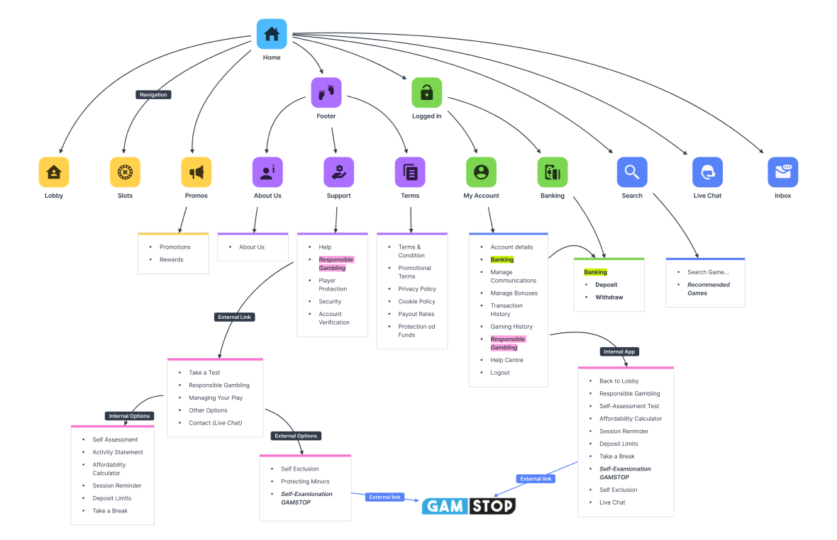
- Information architecture
- Stylescape (Moodboard)
- Design system and style guides
- Logo design
- Wireframing and Mockups
- Web an Mobile UI and Prototyping
- Testing
- UX Audit
Role
Lead UX/UI Designer
Duration
6 Weeks
Tools
Figma, Milanote, Google Analytics, Photoshop, Illustrator
Business Objective
The stakeholders business objective was to enhance usage and draw in new clients.
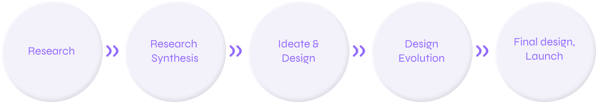
Design Process
UX Research
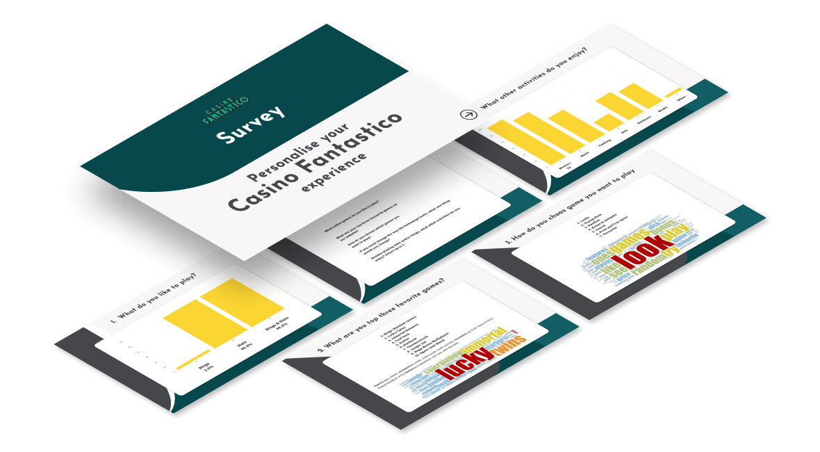
Survey
Based on the demographics and behavioural characteristics of users to the company’s other casino websites, the target audience for the new online casino was already established, nonetheless, I ran a survey to learn more on what modifications I might want to make to my design concepts going forward. The questions I asked on the survey:
1.What online games do you like to play?
2.What are you top free games on online casino or bingo websites?
3.How do you choose which games you want to play?
4.If you could change the way home page looks, what one thing would you change?
5.Besides playing slots games, what other activities do you enjoy?
Competitor Analysis
Here are the main info findings I gathered from my competitor analysis, which I carried out to learn as much as I could about a new brand and passable style approach:
Fantastico name connections to fantasy, colourful, night life, extraordinary, interesting, entertaining, mystery, magic, flashy, etc.
Target demographic: Male aged 25 to 45
Avoid the circus and superheroes.
Considerations: dark and modern design, mystery and luxurious but modest style.
Ideation
Site Map
Ideation sketches
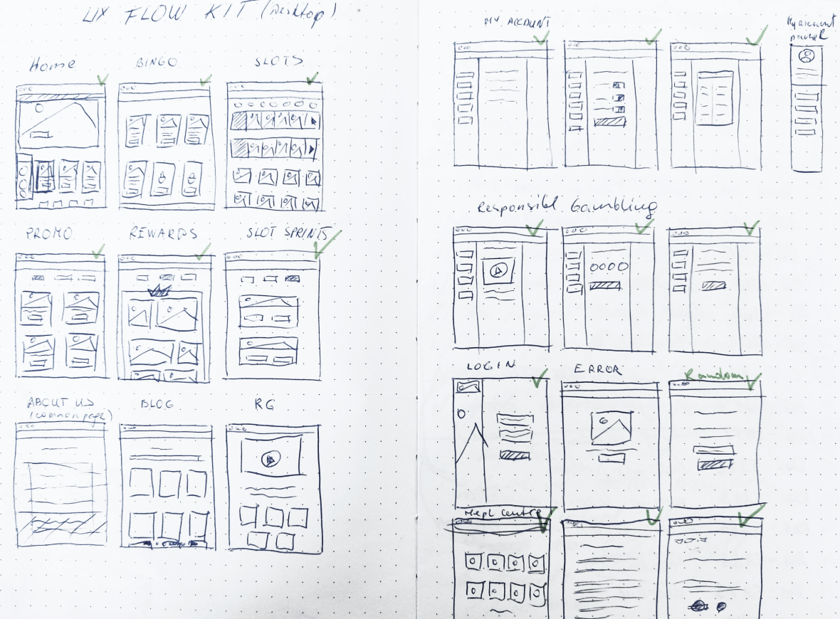
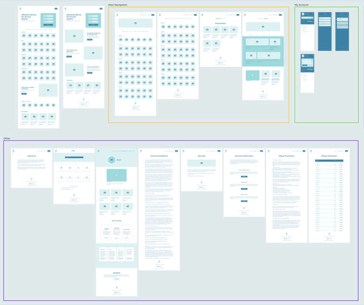
Wireframing
Visual Identity
Moodboard
I crafted a visually compelling moodboard using dark and teal colour palettes, drawing inspiration from online gambling websites and other examples. This spurred the branding identity creation process.
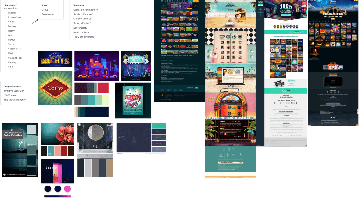
Stylescapes
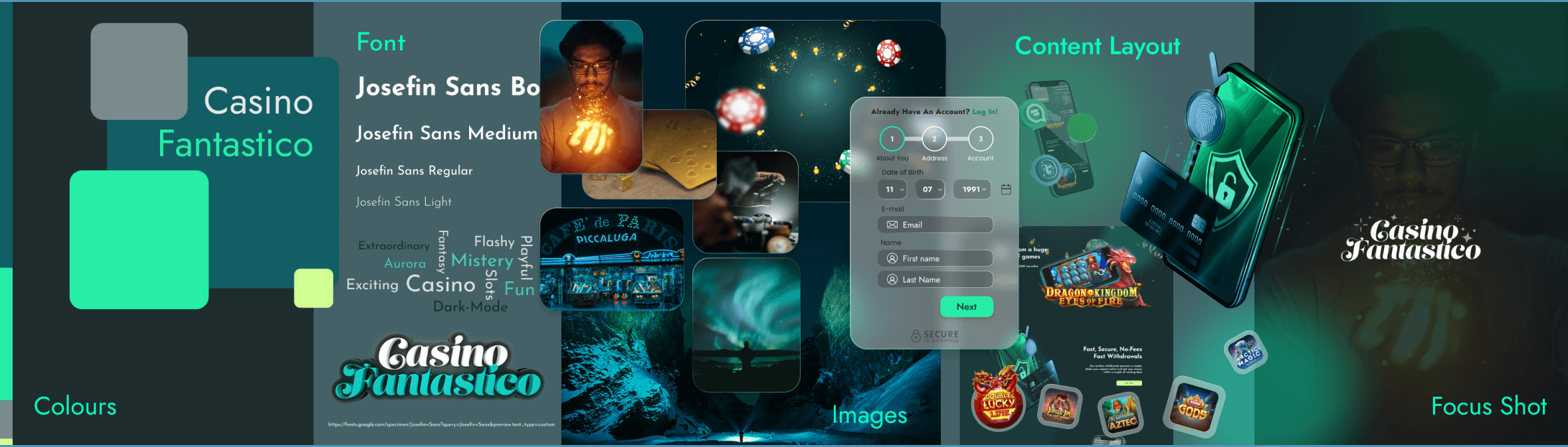
The Stylescape was the next step in my design-thinking process; It helped me in choosing colours, textures, initial design style, typography, a visual approach, and the type of imagery I want to implement. For the website I chose dark teal as the dominant colour to stand out from the sister sites which already used black and dark blue. The aurora borealis was perfect addition to my colour pallet, which is associated with dreams and fantasy.
Using the 60/30/10 colour rule helped me to create a balanced and harmonious colour scheme. The dark teal is used for 60% of the design, which provides a strong foundation. The secondary colour, which is a lighter teal, is used for 30% of the design. This colour helps to add interest and contrast. The accent colour, which is a bright green, is used for 10% of the design. This colour is used to highlight key elements and to create a sense of excitement.
Logo
I assigned our graphic designer Luiza Maya with the task of creating a logo.
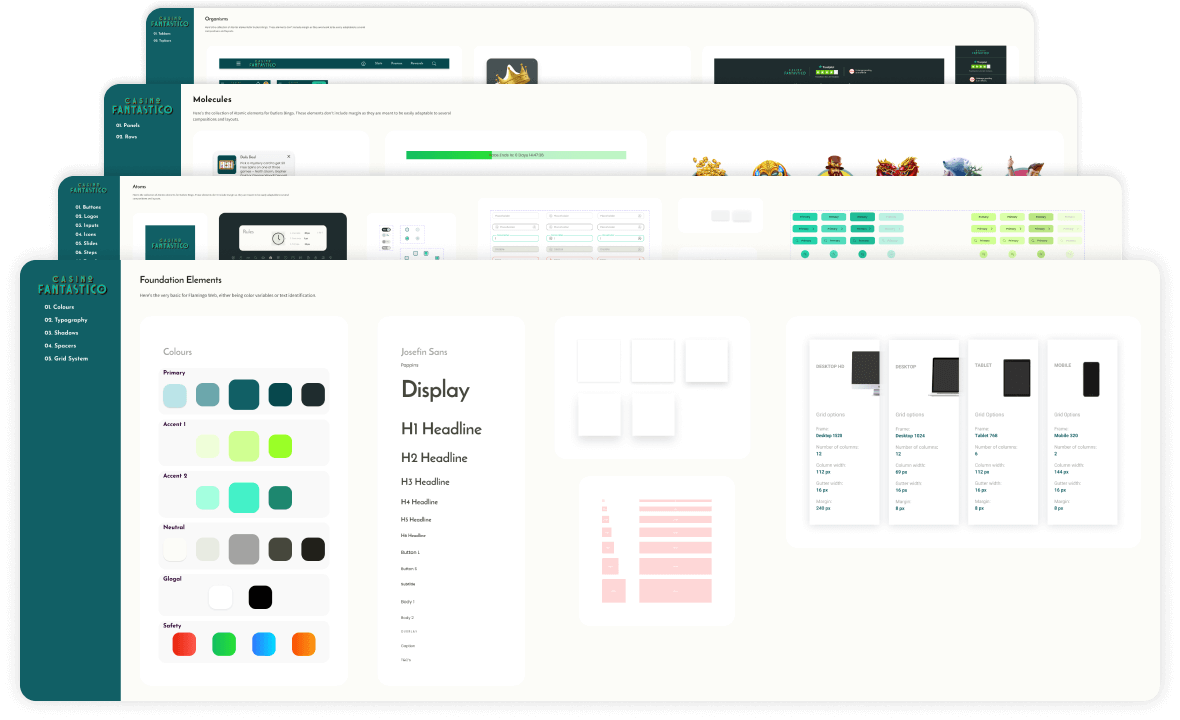
Design system
I build scalable and visually appealing Design Systems using Atomic design, with harmonious typography based on the golden ratio and a structured layout guided by an 8-pixel grid.
Design
High fidelity mock-ups
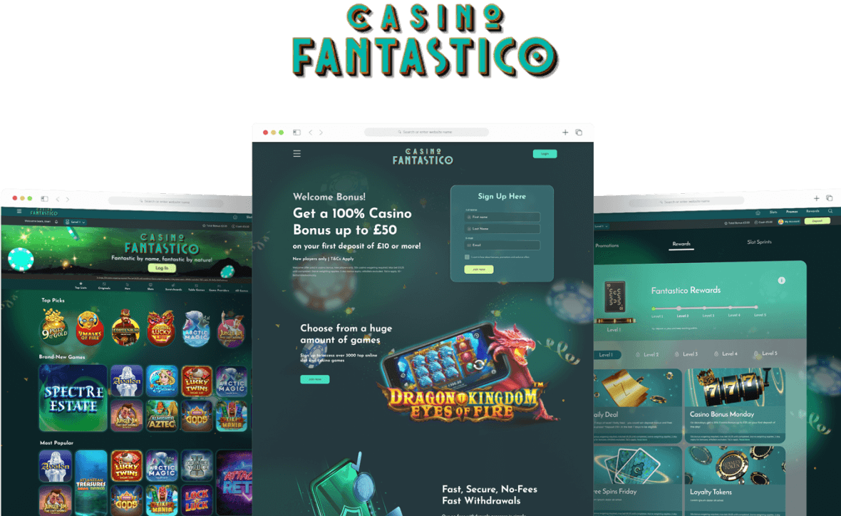
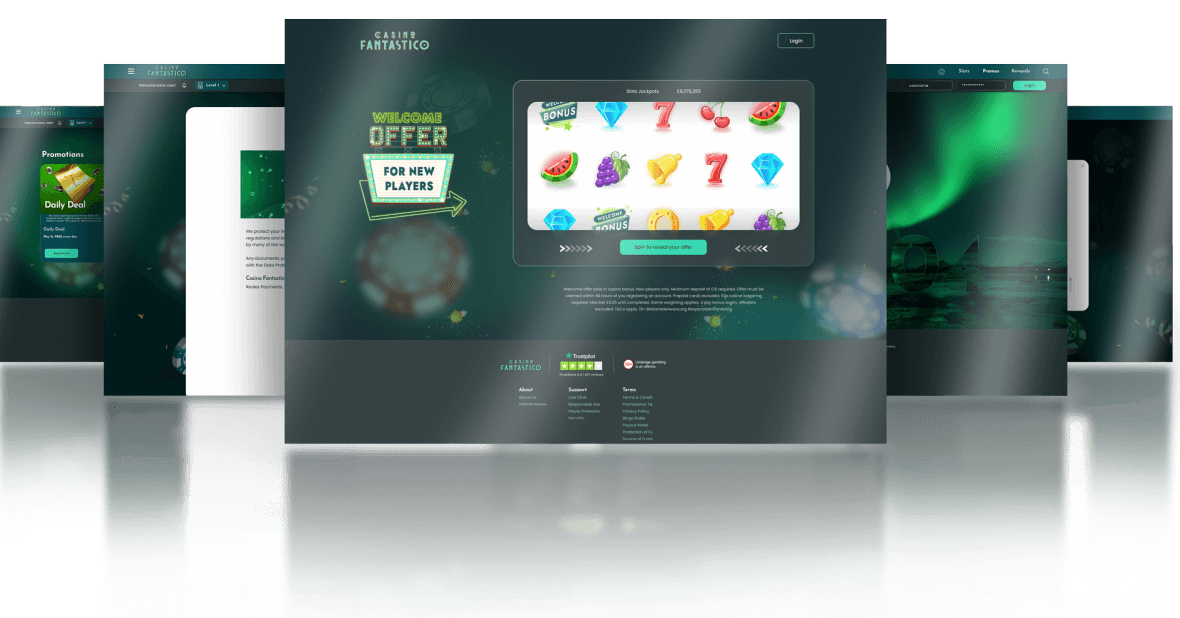
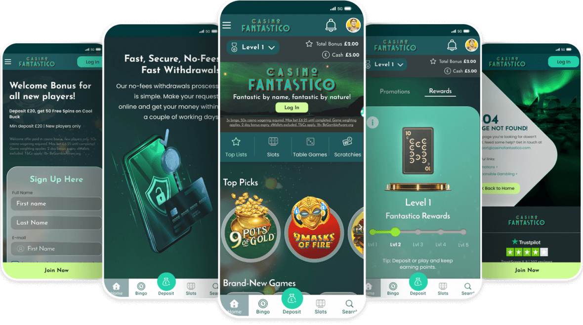
Step into a world where design unlocks hidden realms. My beautifully made designs, inspired by the amazing dance of the aurora borealis, take users on an adventure of wonder and discovery. I've created high-fidelity mockups that smoothly include dark teal, suggesting the depths of the unknown, using a research-driven methodology. Witness the power of user-centric design, where every pixel ignites fantasy and engagement.
Game and promo pages
Utility and empty state pages
Mobile pages
UX audit
The glassmorphism design made it difficult to read text and interact with elements on the interface. Replacing it with a white box design improved the readability and usability of the interface.
The call to action button was not clearly visible and easy to click. Changing the colour of the button to a bright colour made it stand out more and encouraged users to click it.
Created the empty state and maintenance pages with clear and concise language which could helped users understand what was happening and prevented confusion.
It was faster for users to log in and it also helped to increase security when the login page was changed from a light box to a complete page for a more user-friendly design.
Final thoughts
The Casino Fantastico brand was a difficult but rewarding project to lead. I started the project during the COVID-19 pandemic, which presented a number of challenges on its own. However, I was able to overcome these challenges by working closely with my team and by learning new skills.
One of the most important skills I learned was how to lead a design team. I had to learn how to delegate tasks, communicate effectively, and motivate them.
Another important skill I learned was how to identify the needs of my users and how to design a website that met those needs. I also had to learn how to test my designs with users and how to get feedback.
I am proud of the work that I did on the Casino Fantastico brand. I believe that the website is user-friendly, visually appealing, and secure. I am also proud of the skills that I learned during the project. I am confident that these skills will help me in my future career.
Contact
valiux79@gmail.com
Phone
+353 89 435 0505
© 2024 - Valerijus Jurcia / All Rights Reserved