Bonkers
UI/UX challenge
Design a comparison page that integrated the “Calculations” page and the “More Info” details page into a single well detailed page for fintech company.

Project Overview
My task was to design a Comparison page that integrated the “Calculations” page and the “More Info” details page into a single well detailed page
Role
Lead UX/UI designer
Duration
1 weeks
Tools
Figma, Photoshop
Business Goal
Combine two separate pages into one
Challenge Objectives:
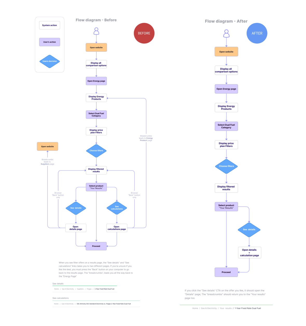
- Simplified User Flow: Redesign the user journey by merging the energy product details and calculations into a single, easy-to-follow page, eliminating any redundancies.
- Clear Information Presentation: Organise and present energy plan details and associated calculations in a clear and structured manner, allowing users to quickly grasp the key information.
- User Engagement: Consider user engagement elements that encourage interaction and exploration(e.g. the tabs on see calculations), making the page informative and enjoyable to use while also focusing on creating clear call to actions for users to proceed with their purchase.
- Reinvigorated User Interface: Elevate the overall aesthetic, while preserving the current colour scheme to ensure brand cohesion. This will provide a renewed visual experience that resonates with the existing design language.
UX Research
UX analysis
These are the key findings I discovered based on the challenge objectives and competition analysis I conducted:
Key findings
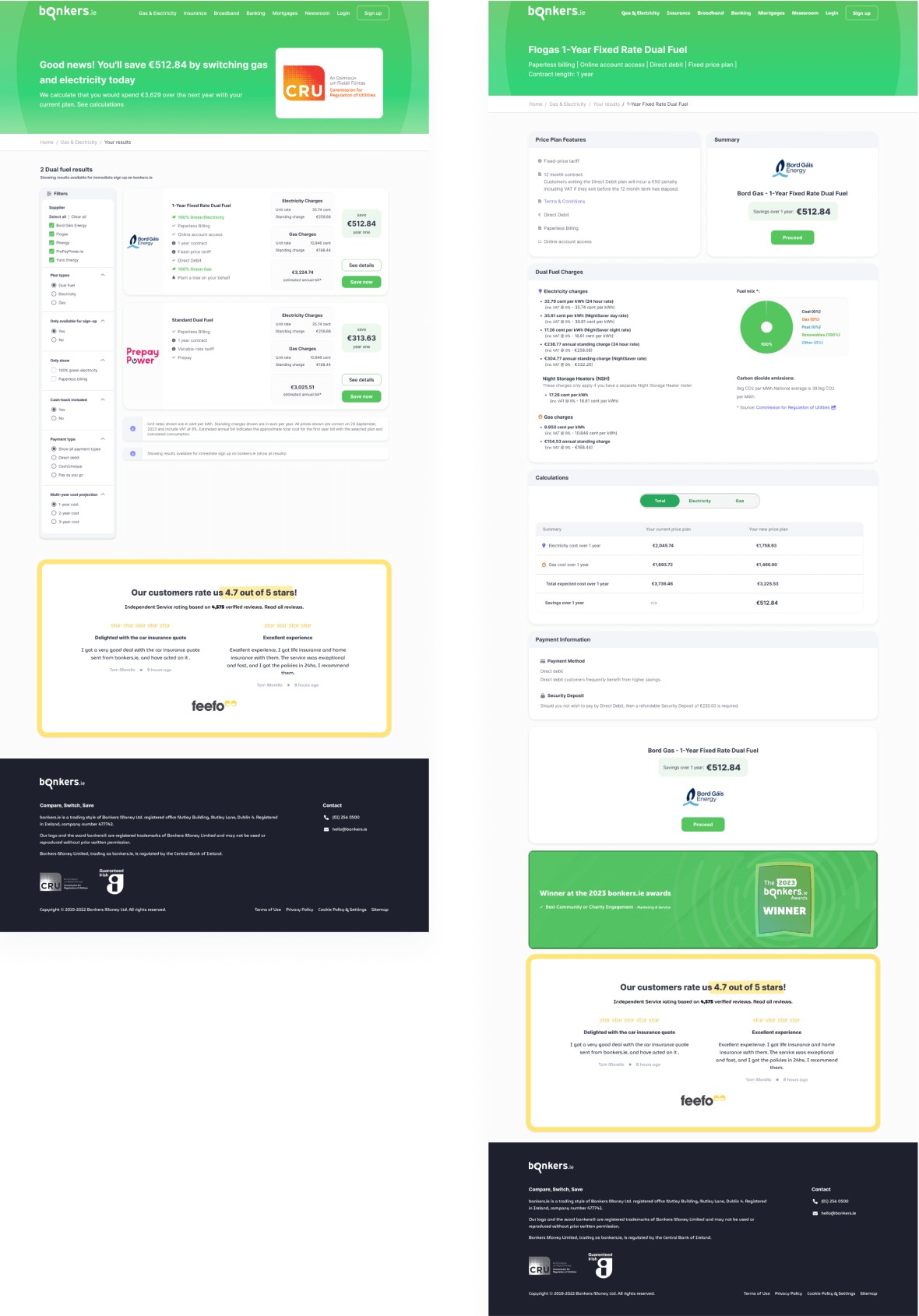
Detail Result Page
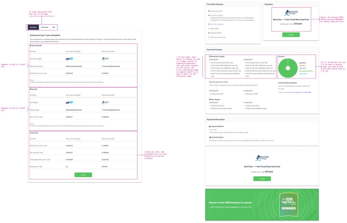
- “Summery” repeats it self on the top and on the bottom (it is needed - because long scrolling).
- The borders on results boxes look dated and don't match the design of the home page.
- Prices for including and excluding VAT are shown independently in the "Dual fuel Charges" box, which makes the information appear cluttered and difficult for novices or even regular to understand. I like how the solutions used by some of the competitors, which either incorporate a comma below the calculation or provide a “toggle” for switching between "Inc VAT" and "Exc VAT."
- Not sure if in the “Fuel Mix” box, do we need to display other fuel options if it’s 0%.
- The emphasis on the “SAVING” is not very prominent.
- Would be interesting to explore possibility to give an option to print the page
- I would prefer to open social proof (Feefo) reviews in a new tab
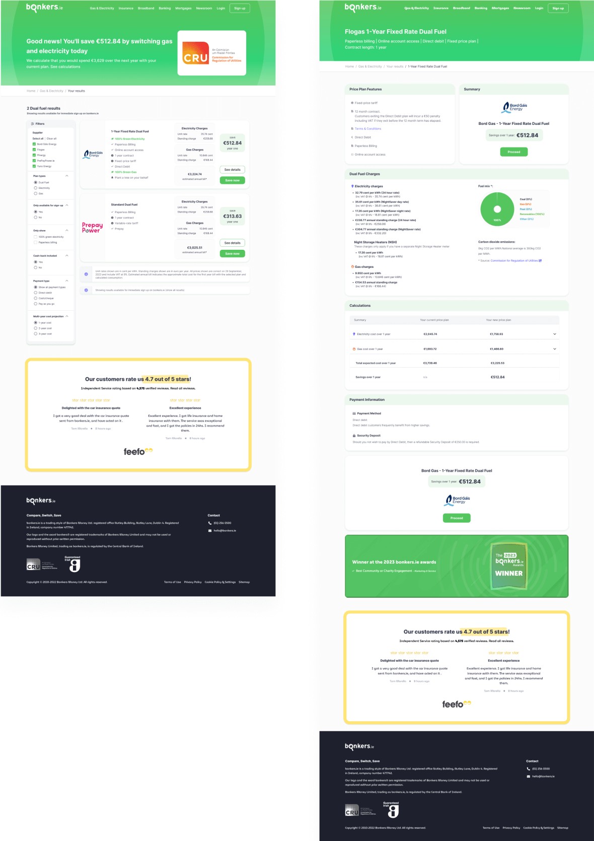
Results Page
- Everything very boxy, the border looks dated
- Filters tabs are displayed almost exactly as a results in the bordered boxes
- “See detail” and “calculations” just a regular hyperlinks not a buttons, of course it is much better to have this info on one page
- The “savings” amount doesn’t stand out as much as I would like
- I would prefer to open social proof (Feefo) reviews in a new tab
Calculations Page
- There is no emphasis on "saving" I am not immediately aware of it.
- “Total costs” repeats the same information as “gas bill’ and “electricity bill”
- The same information is shown in the "Electricity" and "Gas" tabs as it is on the "details" page. In addition, Including VAT and Excluding VAT are once more shown individually.
- “Breadcrumbs” leads all the way back to the “compare-gas-electricity-prices” page, so if I want to go back to the results page I have to click browser back button
- The savings amount is hidden hard to notice at the end of “Electricity” and “Gas” calculations
Competitor findings
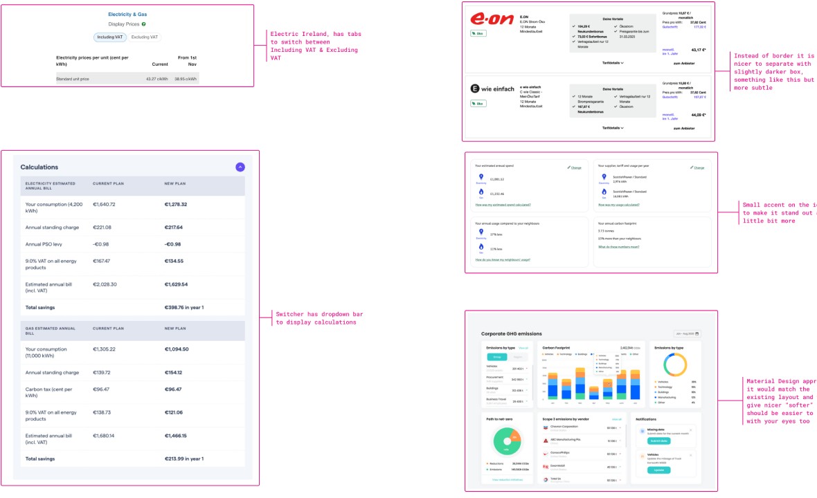
- Electric Ireland, has tabs to switch between Including VAT & Excluding VAT
- Switcher has dropdown bar to display calculations
- Instead of border it is nicer to separate with slightly darker box colour, similar to E-On
- Material Design approach, it would match the existing layout and would give nicer “softer” look should be easier to scan with your eyes too
Ideation
Task Flow Diagram
Design
Website pages - before
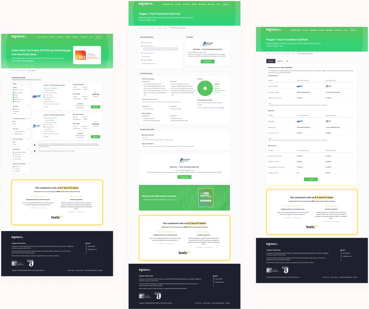
Website pages - after
v1
v2
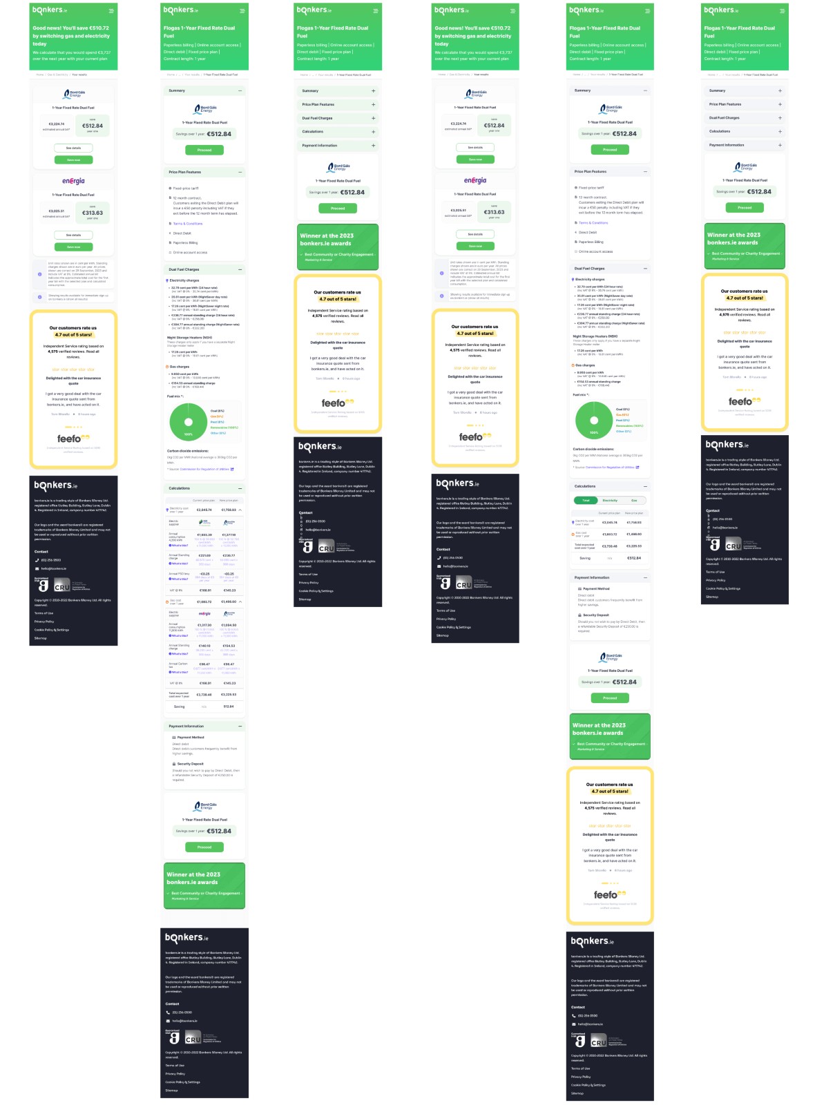
Mobile mocks - two versions
Final Thoughts
I sincerely appreciated the opportunity to demonstrate my skills on this project. I thoroughly enjoyed the challenge and learned a great deal about the company. My approach involved understanding the existing pages, conducting a UX analysis, creating a flow diagram, and conducting a competitor analysis. I then implemented design changes, including removing borders, adding shadows, emphasising key information, merging calculations, providing data breakdowns, enhancing the filter window, and using the INTER font. I am confident that these skills will be valuable to the company in the future.
Contact
valiux79@gmail.com
Phone
+353 89 435 0505

© 2024 - Valerijus Jurcia / All Rights Reserved